
As the UK and Ireland’s leading supplier of prefabricated balconies, Sapphire sits close to the architectural world. This offers us a front-row seat to see the direction of travel in terms of the newest architectural trends developing in these regions.
Here we’ll cover five trends emerging in the world of mid- and high-rise buildings, focusing particularly on façade design and development.
Confronting the ubiquity of the quadrilateral head-on, architects are finding novel ways to soften harsh angles, harking back to the organicism that defined the early 20th Century.
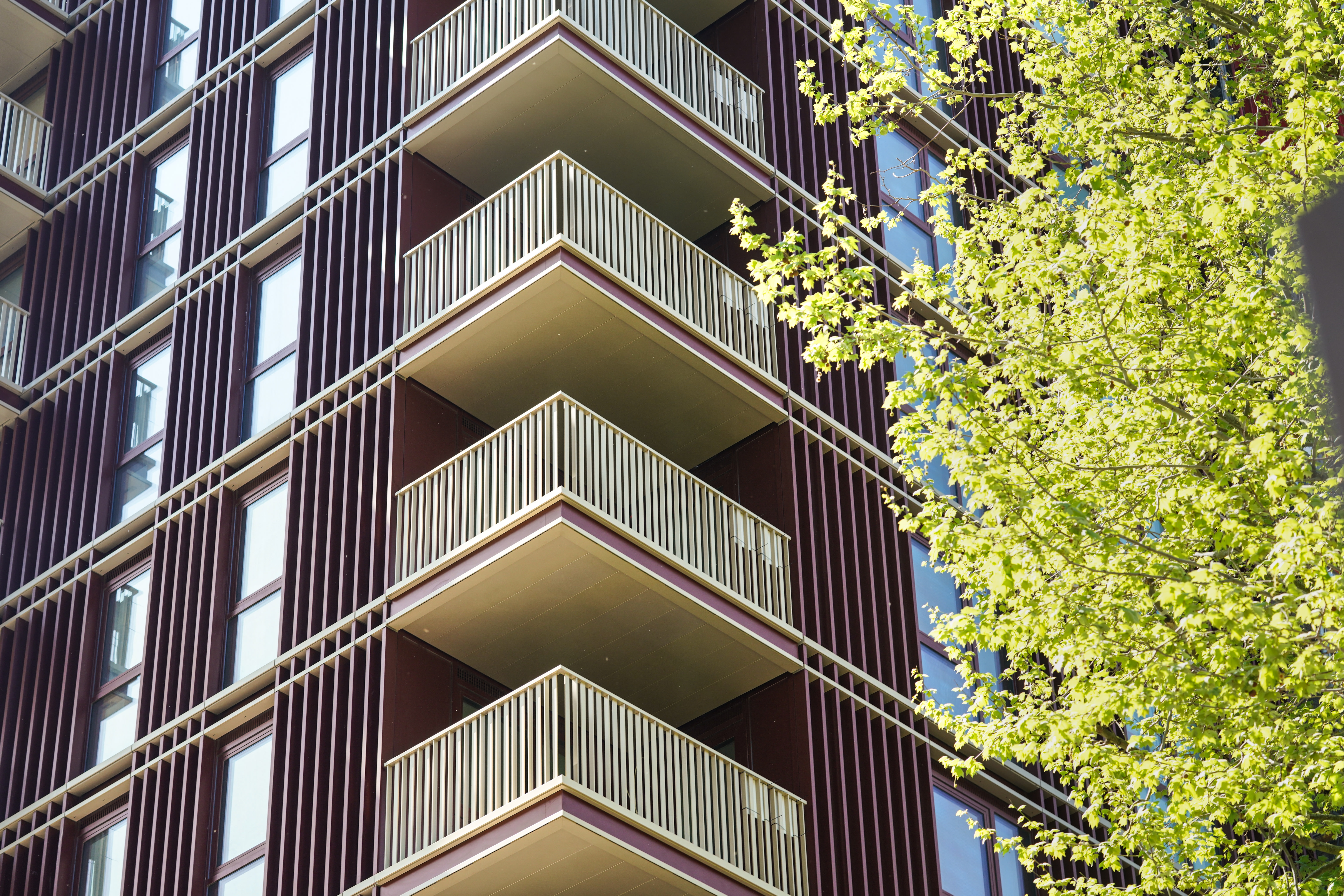
The rectangle: a simple shape that maximises floorspace, provides structural rigidity for higher floors and ensures consistency across floorplans. It’s the perfect form for a tall building, which is why it’s become almost synonymous with the term ‘tower block’.
But could the rectangle be a little too perfect? In the midst of a residential building boom, cities across Britain and Ireland have been taken over by the uniformity of the rectangle. It’s getting a bit repetitive. Architects know this, and many admit to wanting rid of the rectangle altogether.
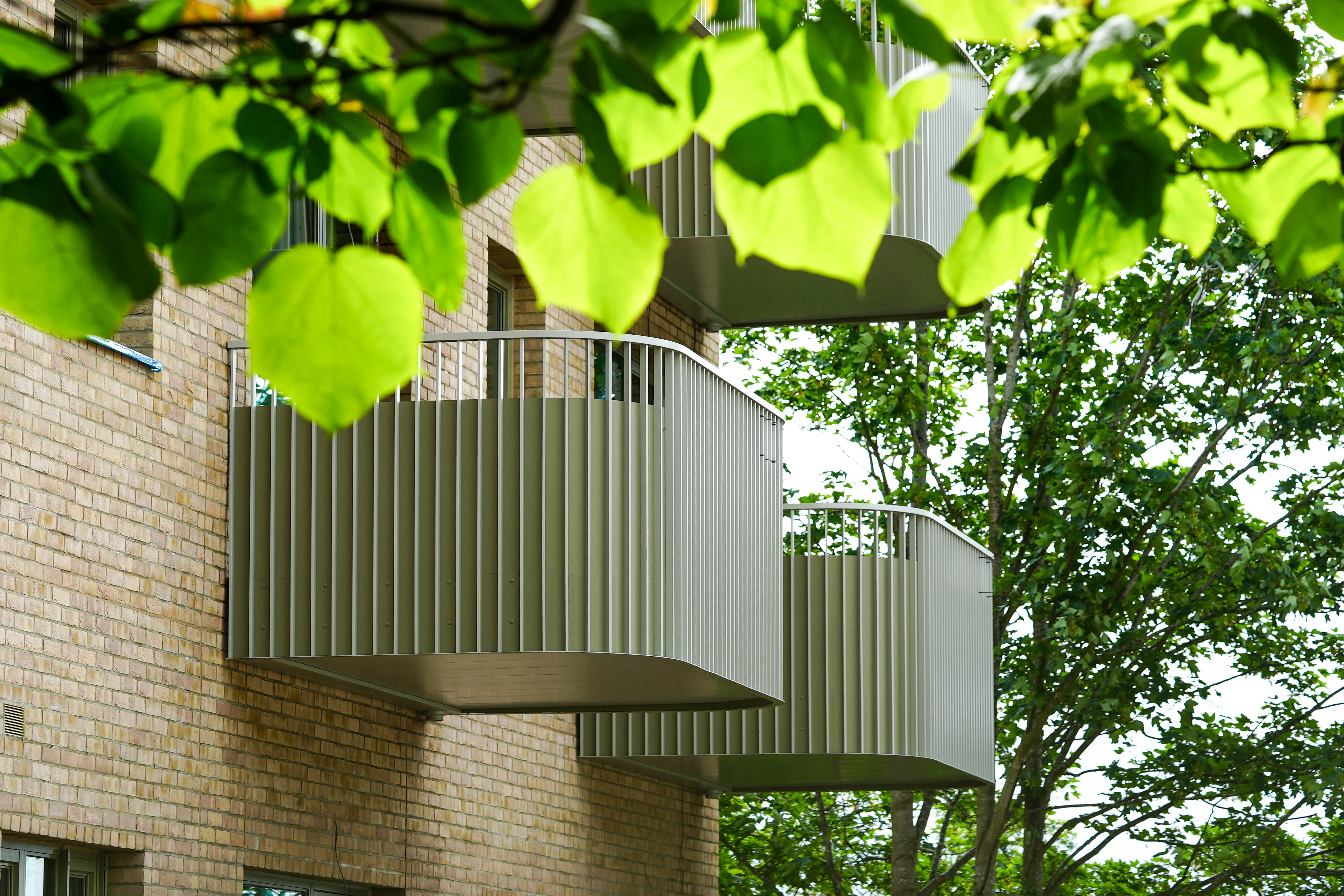
This is easier said than done. After all, nothing functions quite like a rectangle. But there is a compromise: the façade. When you can’t design the edges out altogether, you can always design around them. And so, calling on the elliptical days of Art Deco, the waviness of Streamline Moderne and the organic geometry of Biomorphism, architects are finding novel ways to give their buildings the impression of curves – while still relying on the faithful rectangle for their floorplans.
There are many ways to ‘soften’ a façade, ranging from simple to savvy. Keep your eyes peeled for the following elements: circular recessed floors; swooping sculptural façade elements; curved balconies; elliptical windows; and radius corners at strategic points of the building. Working together, these features give their edifices a soft and flowing appearance, with lines wrapping and flowing instead of stopping abruptly, creating the illusion of the whole building gently curving this way and that – often while still leaning on a rectangular footprint.
Polychromatic banded brickwork, asymmetrical details and neo-oriel windows return to add playful sophistication to mid- and high-rise façades.
Still one of the most sought-after architectural styles to this day, the Queen Anne Revival was many things: a concerted effort to extract every ounce of beauty from Victorian brickwork; a staged revolt against the sprawl of redbrick, two-up-two-down houses that were quickly consuming urban landscapes; a playful fashion that rewarded bold creativity.
As it was 200 years ago, so it is today. Queen Anne is back once again to save us from the monotony of single-shade façades, with their same-same windows and symmetrical bits-and-bobs. Here come contrasting materials, irregular details, oriel windows, varied rooflines and projecting bays. Perhaps most prominently, here come patterned façade colourways – especially the banded patterns that became symbolic of the style in London.
The Queen Anne Revival Revival is not all style over substance. By utilising the material technologies of the day, architects are finding bold and cunning ways to re-interpret the style in spite of stricter-than-ever building regulations. What look like jazzy brick slips disguise fire shielding around RC framed envelopes; statement balconies incorporate Passive House-standard thermal bridging; bold oriel windows incorporate composite aluminium for thermal and acoustic performance.
Queen Anne Revival Revival is subtle, but it’s this subtlety that forms the greatest part of its charm. Look out for individual details mixing old inspiration with new technology to create homes that not only fit the established British and Irish vernacular, but which move the needle ever forward.
Pic’n’mix bricks provide a raw canvas, inviting interplay from clashing cladding, patterned metalwork and other stylish embellishments, creating an air of lo-fi sophistication.
Sometimes bursting from the wall in an explosion full of pixels, sometimes reposed in quiet elegance, but always there to make a statement, Bricks & is two things: bricks, and something else. That ‘something else’ is entirely up to you. It could be a material (think patterned porcelain tiles, laser-cut aluminium, statement glass, or monolithic ironworks). It could be a shape (have a play with recessed alcoves, stepped gables, symmetry and asymmetry, or streets in the sky). It could even be another brick: another colour, another pattern, another shape.
Bricks & is not just an aesthetic style – it’s a showcase of new architectural technology. The opportunities available through this style are unlocked by the convenience and brilliance of brick slips, which allow for bricks to extend further and faster than ever. The brick is free now, unshackled from the inconvenience of gravity and the limited reach of the bricklayer’s trowel. It can go where it’s never gone before, try things it’s never tried.
In this context, brick cladding is no longer fulfilling the utilitarian function of ‘something to cover the concrete’ – now it’s unleashed, free to be playful, free to get a bit weird. Jumble the bricks up like a bowl of bircher muesli, clash them, contrast them, randomise them. Pair them with wood, pair them with steel, pair them with glass. Do whatever you like, just don’t make it boring.
You’re closer than you think to creating a beautiful Bricks & façade. All you need to get started is a strong imagination, a lot of bricks, and a bit of bravery.
Sudden clashes of material, interrupting shapes and abstract bursts of colour – at scales ranging from deftly subtle to totally-in-your-face – imbue façades with a touch of avant-garde.
Sometimes, a building strives for order and symmetry. Other times, a building decides to rebel against the system. You’ll see these buildings from a distance, challenging the skyline as they jut out any which way, suddenly and randomly changing colour, material and shape, defying gravity, warping spacetime, transcending reality. It’s like someone looked at an Escher staircase and thought: ‘yeah, we could do that.’
If modernism is function over form, Kept-ya-guessing is function despite form. Here are high-performing, liveable and workable spaces, complete with all the conveniences of modern life, wrapped up in a impressionist aesthetic. It’s dada. It’s jazz. Every other building is a cake: neatly assembled, finely decorated, perfectly structured. Kept-ya-guessing is a paella. Chopped up, whisked around, made up of every colour under the sun, and yet still bursting with flavour. Why aim for perfection when you could aim for fun?
Kept-ya-guessing harks back to the prehistoric days of architecture, when façades were beautiful because they were hotch-potch. The irregularity of our ancestral shelters not only mimics, but embraces the chaos of the natural order. They inspire us to look beyond the superficiality of beauty and to marvel instead at the complexity of what’s beneath. They weren’t aiming for perfection, so why should we?
They say good architects know how to design to the grid, and great architects know how to break the grid. Truly generational architects know how to completely reinterpret the grid, to re-write the rules of physics in pursuit of new forms. Kept-ya-guessing is a rebellion, urging us to return to the chaos of the natural order. Perhaps this could be a new design format for urban environments? Rooted in the deep complexity of the human psyche, unshackled from the self-consciousness of the modern era, and yet fully functional. Formless. Shapeless. And still, somehow, tangible.
Giving the façade a chance to breathe, negative space harnesses white space to capture light and air in the midst of an ordinarily flat surface.
Wondering what to put in your façade to add a dash of character? How about nothing at all?
Negative space, which is possibly a more palatable word for ‘gap’, seems to be making its way into all sorts of new high-rise buildings. The intentional omission of the façade –sometimes in a quiet corner of the building, sometimes across a whole floor – is not only eye-catching from street level but creates the opportunity for interesting design elements to fill the void. Sky gardens, observation decks, and sun terraces may feature, taking advantage of the natural air and light while also breaking up the monotony of the vertical aspect.
Negative space is a tricky one to get right. Done poorly, it leaves nothing more than an expensive hole that leaves everyone (not least the developers) questioning all the ways that space could have been better utilised. But done well, it creates a space of visual interest, interrupting an otherwise rigid façade with a showstopping third dimension and begging the question: how did they manage that?
As these emerging trends reveal, we are entering an era of unlimited experimentation in façade design. New construction methods and material technologies open the door to greater feats of engineering prowess, lifting us out of the age of the ordinary tower block. New vernaculars are emerging on both sides of the Irish Sea, defined not by austerity but by imagination.
At Sapphire, we’re excited to play our role in the development of these new styles. Our prefabricated, aluminium balconies enable architects to achieve their creative aspirations at scale. Speak to Sapphire today to find out more.